Blog
Is designing for print a dying art?
At Pillory Barn, we’ve been designing for print since long before the digital revolution.
Our company heritage, going back 30 years, stems from a time when layouts were prepared by hand, film separations were checked with a magnifying glass, and colour meant literal mixing of ink. That heritage matters, because while design has evolved, the fundamentals of great print work remain the same: precision, craft, and an understanding that print is unforgiving in a way digital never will be.
It’s more than just screen vs paper
While most design today starts on a screen, it’s easy to forget that print and digital are not simply two outputs of the same creative process. They’re governed by very different rules and approaches – and we wanted to share some of our insight with you.
On screen, colours glow in RGB light. But in print, everything is grounded in CMYK ink, four pigments, layered and combined, each with their own behaviour on different stocks of paper. That’s why designs that look vivid on your laptop can feel flat once printed, unless they’ve been properly converted and proofed.
Resolution is another stumbling block. For web, 72–150 PPI (pixels per inch) is perfectly fine. But for print, anything less than 300 DPI (dots per inch) risks looking soft or pixelated. We still remember the first time we were supplied a low-res PNG for a full-page advert; the disappointment of fuzzy lines instead of crisp quality ones, is something you only let happen once.
And if that wasn’t enough, there’s the issue of contrast and legibility. A dark blue headline may sing on screen but print it on a slightly absorbent stock like newsprint, and suddenly it muddies. That’s why we still proof with our print partners under different conditions, checking how the ink sits and ensuring nothing gets lost in the printing process. We have many years of experience and learnings.
Print doesn’t offer the safety net of “edit and re-upload.” Once it’s off the press, it’s permanent. That’s why it demands careful attention.
Discipline meets detail
Designing for print is as much about discipline as it is creativity. At Pillory Barn, we know the rules by heart after over 30 years of experience:
- Registration is non-negotiable. A millimetre out can throw the whole piece off. Choosing a quality-focused print partner is essential for this.
- Full bleed and crop marks must be correctly set. Without them, edges risk white borders or trimming errors.
- Pre-flighting print files before they reach the press avoids any nasty surprises like missing fonts, low-res images, or RGB colour sneaking in where it’s not wanted.
- Typography is handled with particular care. We’ve learned to balance leading, kerning and point size in ways that keep blocks of text readable once ink hits paper – and even more so when colour is involved.
- Large-format print like posters, banners and exhibition panels, require a different mindset. Viewing distances, scale, and substrate all affect how colour and resolution behave.
- Pantone colours are often used for brand accuracy or vibrant results beyond CMYK. Knowing when to specify Pantone versus CMYK process inks is a subtle but vital skill.
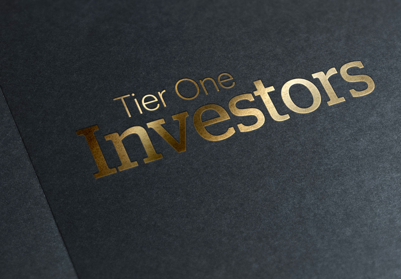
- Special finishes such as foiling, embossing or spot UV need to be considered at the design stage, with specific layers set up for printers and alignment carefully controlled. Spot colours often underpin these effects and must be built into artwork from the very start.
These aren’t just technicalities; they’re the difference between a flawless finish and an expensive reprint.
Why does print feel more specialist today?
One of the interesting shifts in our industry is how fewer designers now cut their teeth in print. Digital-first workflows are faster, cheaper, and more flexible and great for campaigns that live online. But that also means the art of designing for print is becoming more specialist, or perhaps even lost!
There’s a richness to print that digital can’t match. The weight of a textured stock, the depth of a spot varnish, the elegance of foil blocking, all combines to create an experience you can hold in your hand. And it takes real expertise to plan for those effects from the very first sketch.
At Pillory Barn, we are experts at bridging both worlds.
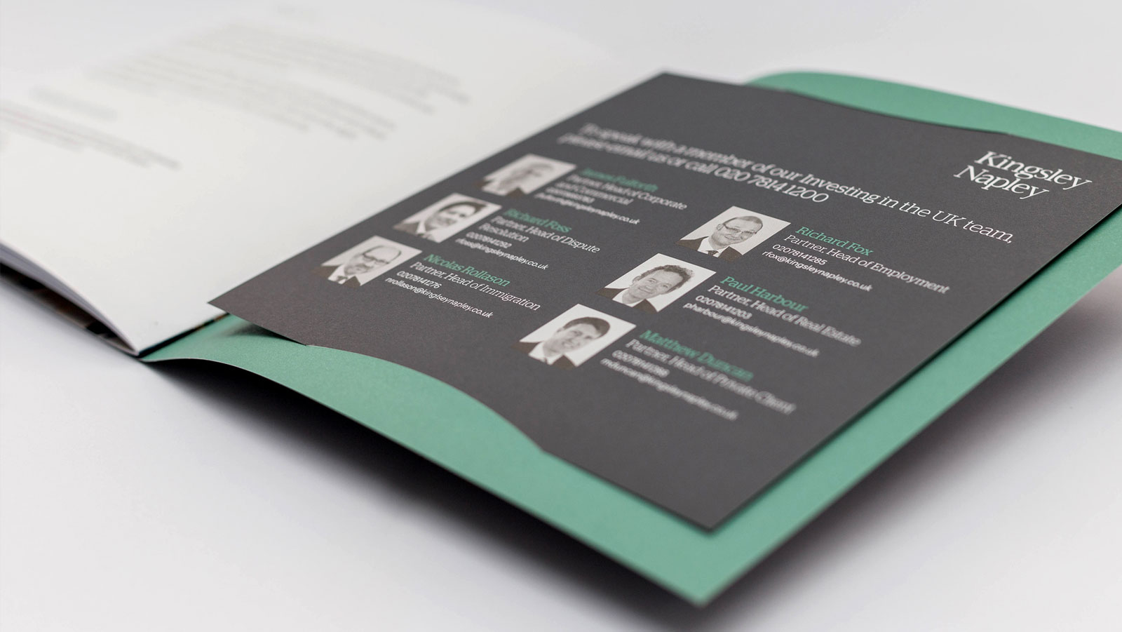
We bring the speed and creativity of digital, but we never lose hold of the traditional craft that informed that digital creativity. That balance is why our printed work, whether it’s brochures, large-scale exhibition materials, property reports, or the humble business card continues to stand out and be delivered with expertise and wisdom.
Print vs digital: a quick comparison
Sometimes, it helps to spell it out:
| Design for print | Design for digital |
|---|---|
| CMYK (ink) | RGB (light) |
| 300 DPI | 72–150 PPI |
| Fixed, permanent | Flexible, editable |
| Tactile, textured | Interactive, animated |
| Requires proofing discipline | Allows instant updates |
Print design isn’t just an output, it’s a craft. It requires knowledge passed down from the pre-digital era, when every piece was carefully planned and precision was king.
At Pillory Barn, we’re proud to carry that knowledge forward.
So, whether you’re commissioning a flagship brochure, a detailed report, or a piece of creative campaign collateral, remember this…
Designing for print isn’t about nostalgia. It’s about quality, credibility, and making something that lasts.