Kent Fire and Rescue Service
Developing a unified brand to reflect an ever-evolving organisation.
We worked closely with the Kent Fire and Rescue Service (KFRS) Communications team to deliver a new brand personality with a more relevant customer inclusive story and strapline. From stakeholder engagement, through to brand messaging, visual style and a digital brand book.
In 2020 we worked closely with the Kent Fire and Rescue Service (KFRS) Communications team for a refreshed brand identity that would reveal the rich diversity of the organisation today, from services to people, respecting the past but looking to the future.
The project began in January and February that year with our project team hosting four stakeholder focus groups to dig deeper into the views of people across the organisation – from frontline staff to the senior management team.
The results from these sessions helped to inform the development of a new, enduring brand style and personality that comprehensively considered all areas of the business.
These themes reached into the past for long standing strengths of Kent Fire and Rescue Service as an organisation, as viewed internally and by the public, but also the aspirations to deliver a fresh unified voice and personality.
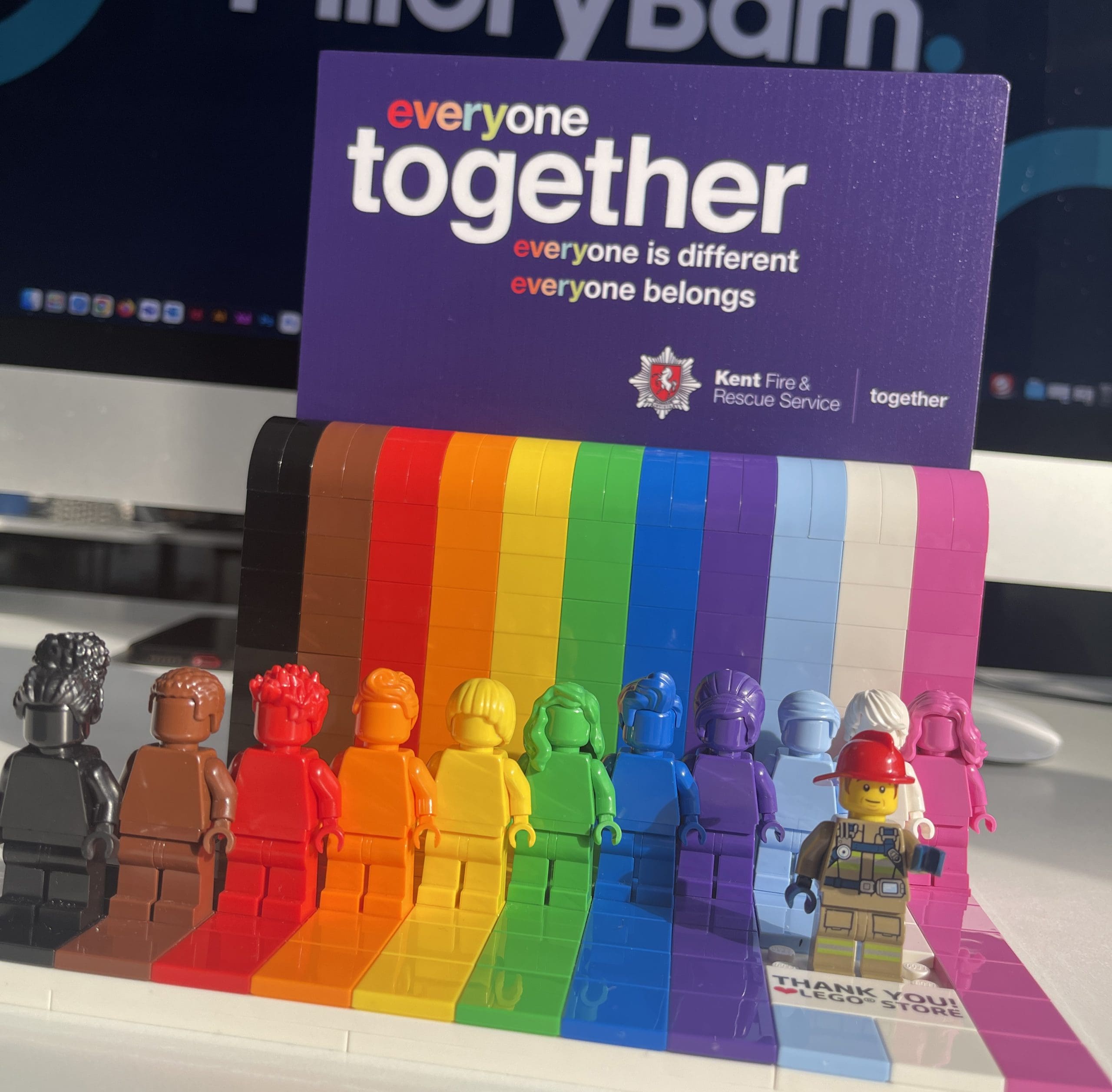
The ideas of collaboration, inclusivity and the championing of social responsibility were threads that ran through all the stakeholder sessions. These brand pillars were a guide to how KFRS communicated, behaved and presented themselves. From this a new strapline and narrative emerged that would be at the heart of all elements of the new brand. ‘Every one of us helps to save lives. We are one team. Together, we are Kent Fire and Rescue Service.’
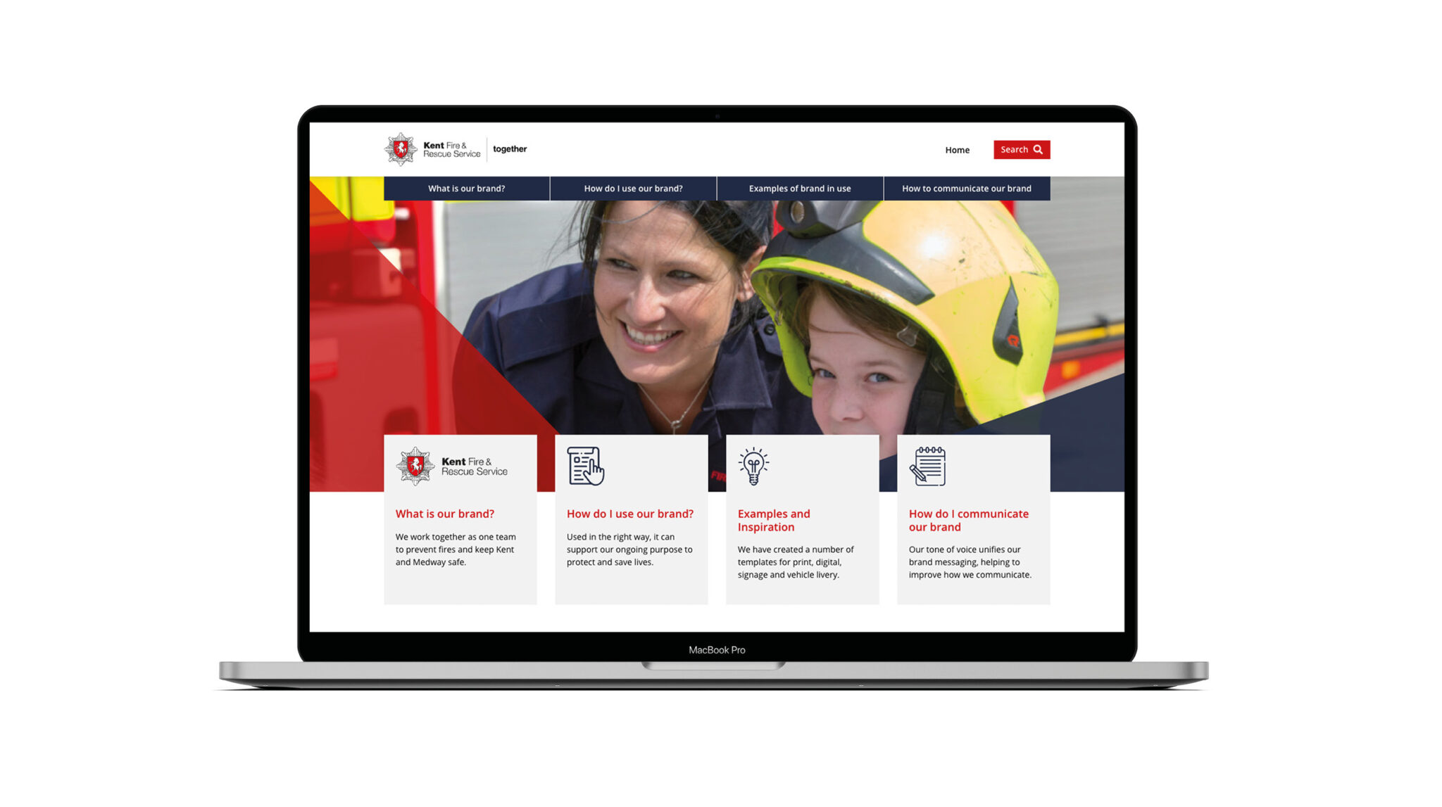
Working closely with the KFRS communications team we developed a refreshed design style that represented their visual identity. While the logo remained unchanged, other elements were developed including colours, imagery, fonts and a new bold graphic style. Historically red was the organisation’s primary colour. We introduced a dark blue as a core colour to create an instant recognition when communicating the brand.
The new brand style and message were rolled out across the organisation for all elements of internal and external communications from printed materials to social media graphics and staff intranet. All elements were brought together in one new brand book with an emphasis on everyone in the organisation being able to buy into the new brand and future usage.
Developing a unified tone of voice for KFRS was important to this project, providing clarity on expressing the organisation’s brand personality. The resulting tone of voice document was a first for the organisation. It was also a great example of collaboration with Pillory Barn working closely with KFRS’ communications team to build a guide that is both easy to understand and implement.
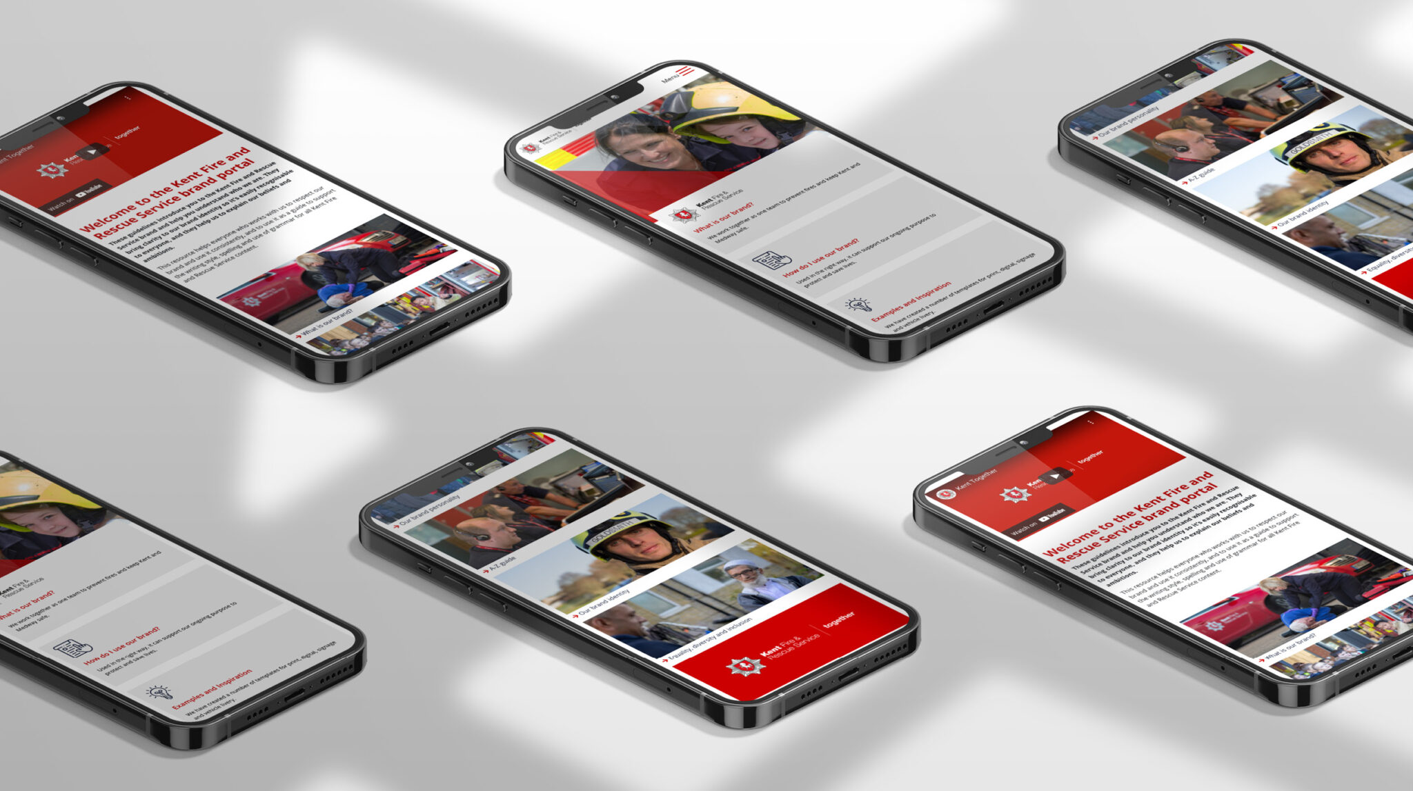
Following the completion of the brand work we continued our work with KFRS to design and build an online brand portal. Starting with a UX session we worked with key stakeholders before turning to the design, build and testing. The resulting digital brand book is unique to Fire Services/public sectors.
To launch the new brand identity, we worked with KFRS’ communications team to create a short video that would be presented to around 1,000 members of the organisation at a launch event with great feedback.
The whole project delivered at the height of the Covid-19 pandemic was also a great testament to the range of talents and flexibility of Pillory Barn from copywriting and strategic expertise to brand marketing, web development and design.